50th Birthday Wishes: 8 Meaningful Templates
Finding the right words for a 50th birthday can feel oddly difficult. You want to honour a major milestone without making the message sound like a


Sep 30, 2026 | 16 Min Read

Lilac works with neutrals, blush pink, mint green, jewel tones, terracotta, metallic gold and deeper lilac shades. The best choice depends on the mood, contrast and application, whether you're styling a room, planning an outfit or creating a personalised ecard.
What colours go with lilac if you don't want the result to look overly sweet, cold or dated? The answer starts with understanding lilac as a light purple whose character changes beside warm, cool, muted and high-contrast colours. Cream makes it feel calm, gold makes it celebratory, charcoal makes it sharper, while terracotta gives it an earthy modern edge.
This guide organises eight lilac colour pairings, from quiet and understated to bold and dramatic. For each palette, you'll find practical hex combinations, outfit and interior ideas, and ways to use the colours in a collaborative greeting card. Start with one dominant lilac shade, add a supporting colour, test text against every background, then adjust the balance for the setting.
The same method works for a serene home, a spring outfit, a professional leaving card or a digital keepsake shared across the United Kingdom, United States, Australia, Canada, India and Africa. If you're planning a calm interior as well, these serene Chennai apartment guides offer useful inspiration for restrained colour choices. When you're ready to turn a palette into a card, Firacard can help you create an online leaving card or a personalised group design with photos, videos, GIFs and messages.
Soft neutrals are the easiest place to start. Pair lilac with cream, pale grey, warm white or light wood when you want an elegant palette that feels composed rather than colourful. UK interiors coverage frequently presents lilac as a versatile base, especially alongside white, soft grey and light wood, while other guidance recommends creams and whites for a soothing neutral interior. Dreams' lilac colour guide also describes lilac as a mid-tone made by mixing red and blue, which helps explain its balance between coolness and warmth.
Try this digital palette:
#C8A2C8#FAF8F3#D9D7D2#303238Use lilac on a feature wall, headboard, cushion or card border. Keep the larger surfaces cream or warm white so the purple remains the focal point without making the room or design feel busy. In an outfit, lilac trousers with an ecru knit or a lilac blouse with a pale grey suit creates a polished combination suitable for work and social occasions.
This palette is particularly effective for a professional farewell card, appreciation message or milestone birthday ecard. A neutral base gives every contributor's message room to breathe, which matters when a group greeting card contains different writing styles, photographs and memories.
Use charcoal or deep grey text on cream, not pale lilac text on white. Add lilac to dividers, small icons and corner details, then preserve generous white space around each message. A mood board template for planning a coordinated design can help you settle the balance before inviting contributors. Firacard's Premium plan supports up to 100 contributors, multimedia elements and slideshow export, according to the publisher's product information.
Gold gives lilac a celebratory character, while lilac softens gold's stronger warmth. The pairing sits toward the more decorative end of the eight palettes, but it remains balanced when metallic detail is used with restraint. Checkatrade's guide to colours that go with lilac includes gold among compatible choices in its colour-wheel-based decorating advice.
Build the palette around these hex codes:
#BFA2DB#FFF9ED#C9A227#43294FThe cream acts as breathing space, lilac carries the main colour, and gold works like punctuation, drawing attention to selected details. In an interior, place lilac on upholstery, painted cabinetry or cushions. Add gold through one lamp, mirror frame, curtain pole or side table rather than covering every surface in reflective finishes. A single gold frame against a lilac wall usually creates clearer focus.
For clothing, start small. Lilac with gold jewellery adds occasion without making the outfit theatrical. A lilac dress, cream shoes and understated gold accessories keeps the colour relationship visible without turning gold into a second dominant block.
On a collaborative greeting card, reserve gold for the border, section dividers, small motifs or highlighted names. Let contributors' messages remain the main event. Deep plum or charcoal text on cream provides a clearer reading path than gold text across a long paragraph. Gold can suit a large title, but fine metallic lettering may lose clarity at smaller sizes, so check contrast before publishing.
An anniversary, recognition card or milestone celebration can draw on the guide to the symbolism of gold when you want the palette to suggest value and occasion. Firacard's Premium plan includes multimedia and slideshow export, useful when the finished presentation forms part of the celebration.
For a relaxed living room, add texture rather than more shine with family-friendly throws by Casamé Home.
Lilac and blush pink make a gentle, welcoming combination. Both colours have a light, softened quality, so they sit together without the abrupt contrast created by yellow, navy or black. UK colour guidance specifically identifies blush pink as a compatible lilac partner, while current UK style coverage also places lilac beside powdery pinks.
Use this palette when the design needs to communicate warmth, affection and encouragement. It suits a birthday ecard, baby arrival announcement, congratulations card or message of appreciation. In a bedroom, lilac bedding with blush cushions and warm white walls creates a softer effect than lilac and stark white. In an outfit, a blush cardigan over a lilac top feels approachable and easy to wear.
Try:
#C8A2C8#E8B7C8#FFFDF9#4B3154Use lilac as the main colour and blush pink as the accent. White borders between sections stop the two shades from merging, especially on a digital card. Deep purple or charcoal text will usually be clearer than a medium pink or lavender font.
Floral branches, petals, leaves and other nature-inspired graphics can reinforce the palette without making it feel overly themed. A delicate botanical motif can work on a baby shower group greeting card, while simple geometric petals may suit a workplace birthday design better. For a more specific visual reference, explore this cherry blossom branch design idea.
This pairing also works across different audiences because it communicates connection without relying on a single cultural symbol. Keep the decoration secondary, and let contributors' photographs and messages provide the personality.
How can lilac feel dramatic without losing its softness? Pair it with one deep jewel tone, such as emerald green, sapphire blue or amethyst. The darker value creates clear separation, much like a strong outline around a delicate illustration. Navy is also a particularly effective partner for lilac, while colour-wheel guidance supports bolder combinations with lively contrast.
Start with this hex-code palette:
#C7A5D8#176B5B#174A78#FFF8E7Choose one jewel shade as the anchor. Using emerald, sapphire and amethyst in equal amounts can make the design feel crowded. Let lilac cover the background or headline area, then use emerald or sapphire for headers, borders and dividers. Cream or white text gives longer copy clearer contrast on a dark jewel background. Check text contrast before sending a digital card, particularly when contributors will read it on different screens.
The palette translates easily beyond the screen. A lilac wall can frame a deep green sofa, navy curtains or a dark blue occasional chair. For clothing, combine a lilac shirt with a sapphire blazer, or add lilac accessories to an emerald dress. Repeat a small lilac detail, such as a scarf, cushion or button, so the lighter colour feels connected to the darker one.
For a creative agency appreciation card, arts organisation farewell card or executive recognition programme, use white panels for longer messages. This keeps every contributor's message readable and gives the card a calm visual pause. A guide to forest green colour combinations can help refine the green side of the palette.
This pairing also suits slideshow exports, where photographs can move between lilac, cream and jewel-toned frames. Test the finished card on bright and dim screens before sending it to an international team.
Among the softer lilac pairings, fresh mint brings a clean, lively finish. Both colours are cool, so they sit together comfortably, while mint adds enough green to stop lilac feeling overly ornamental. The result suits spring clothing, calm interiors and modern collaborative cards.
Build the palette around lilac, then let mint provide smaller areas of focus:
#C9A7D9#A9DCC8#FFFFFF#1F344DLilac can cover a card background, wall or larger textile. Mint works like a visual refresh, appearing on buttons, labels, cushions, line illustrations or one painted piece of furniture. Keeping lilac dominant makes the colour relationship clear rather than turning the design into a general pastel mix.
For a tech startup celebration, university group card, hybrid workplace birthday or modern HR appreciation message, use rounded panels and simple geometric illustrations. Give longer text a white panel and set it in navy or charcoal. Mint and lilac are light colours, so neither provides dependable contrast for body copy.
Try a mint overshirt with a lilac T-shirt for a relaxed outfit. Cream trousers and a mint bag or scarf create a quieter version. At home, combine lilac textiles with sage or eucalyptus for a softer green effect instead of a highly saturated shade.
A collaborative card can assign lilac to the main canvas, mint to contributor labels and navy to names or messages. Firacard's guide to the healing power of green spaces offers a natural starting point for extending the green theme.
Terracotta is one of the most effective ways to make lilac feel warmer and more contemporary. The cool purple and earthy orange-red sit apart in temperature, creating interest without the formality of navy or the sweetness of blush pink. UK trend coverage has described lilac's newer styling as warmer than its Nineties version, with berry, Bordeaux, chrome and sculptural forms replacing an exclusively grey-and-silver approach. UK colour reporting also connects lilac with warm accents and muted earth tones.
Try this grounded palette:
#C6A2C9#C66B52#F7F0E5#49352FIn a living room, use lilac on a cushion, armchair or painted cabinet, then add terracotta through a rug, vase, artwork or lampshade. Cream walls and dark wood can connect the two colours. The result feels distinctive but approachable.
For clothing, combine a lilac knit with terracotta trousers, or use terracotta boots and a belt with a lilac dress. The same pairing gives a community or charity greeting card a warmer tone than a purely pastel scheme. It suits sustainable business celebrations, nonprofit appreciation cards and creative agency farewells.
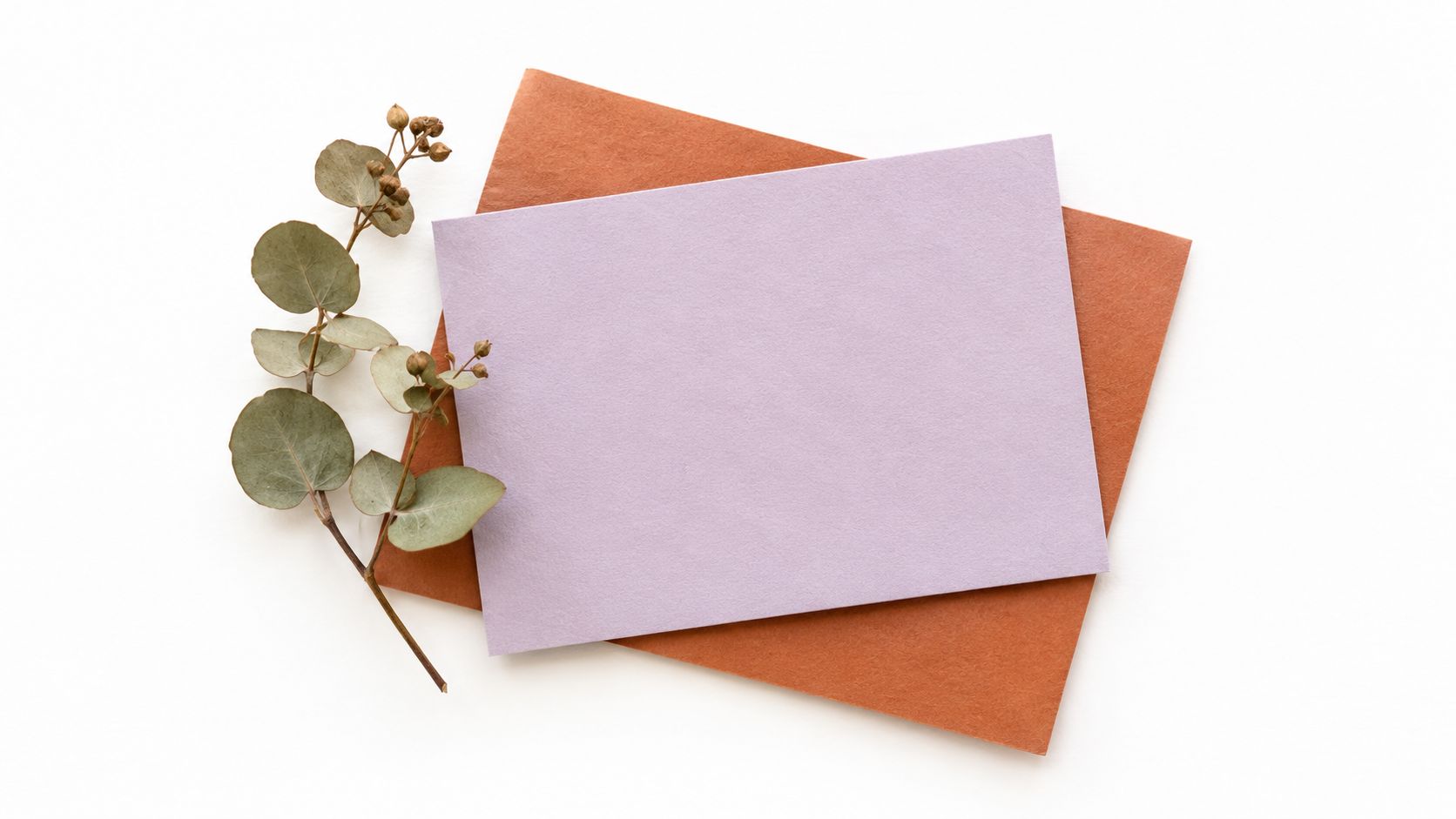
Apply terracotta to decorative elements, headers and borders, not every background. Dark charcoal or deep purple text will keep the message readable. A cream panel between the two main colours is especially useful when many contributors are adding content.
Soft lavender ombre sits at the understated end of the lilac spectrum. It builds interest through tone, like a single melody played at different volumes. Pale lavender, medium lilac and deeper purple create a smooth gradient while keeping the colour family unified. UK decorating guidance supports soft-pastel layering for a hazy, cohesive atmosphere, and UK interiors sources describe lilac as a modern neutral.
Use this tonal sequence:
#E8DDF0#C8A2C8#8064A2#FFFDF7Apply the palest shade to open areas, the middle tone to the main surface, and deep lilac to give the design definition. A wall can fade from light near the ceiling to darker colour below. The same progression works across curtains, stationery or a digital background.
For clothing, pair a pale lavender shirt with a deeper lilac skirt, or keep the outfit neutral and add a tonal scarf. In an interior, repeat the gradient through cushions, artwork and a painted feature. A collaborative greeting card can give each contributor a different shade, creating movement while preserving a formal, coordinated feel. This suits corporate farewells, professional anniversaries, elegant birthdays and conservative industry appreciation messages.
Cream or white text needs a sufficiently deep background. Dark purple or charcoal is clearer on pale lavender, especially for smaller lettering. Use cream panels to separate text from the gradient, and check each contributor area independently.
Silver or pearl can add a restrained finishing detail. Firacard's slideshow export can carry the gradient from one contributor panel to the next without introducing unrelated colours.
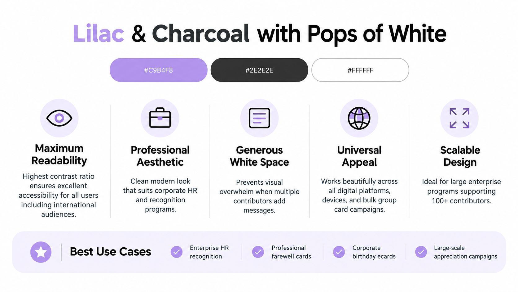
Need a lilac palette with sharper definition? Charcoal and white give this pairing its strongest contrast. Lilac adds colour, charcoal anchors the composition, and white creates clear space between them. The result feels polished without becoming severe, making it useful for interiors, clothing and professional communication.
Try this set of hex codes:
#B99BCB#292B31#FFFFFF#E8E7E4Start with white as the background, then use charcoal for body text, borders and frames. Reserve lilac for headings, dividers, icons and selected highlights. Soft grey can connect the lighter and darker tones without adding another strong colour.
In an interior, white walls, a charcoal sofa and lilac cushions create a balanced modern scheme. For clothing, wear lilac with a charcoal suit, trousers or coat. A white shirt or trainers keep the outfit crisp, while a soft-grey accessory can reduce the contrast.
Charcoal text is clearer than lilac text on white, particularly at smaller sizes. Use white or soft grey lettering on charcoal only after checking the contrast, and avoid small lilac type over white. Apply the same check to contributor panels, names and captions, rather than reviewing only the cover page.
This palette suits HR recognition programmes, professional leaving cards, corporate birthday ecards and appreciation campaigns for schools or nonprofits. Give each contributor a white or pale-grey panel so a large collection of messages remains orderly. For a bulk group greeting card, a restrained layout leaves room for varied messages and media. Firacard's Infinity plan is designed for unlimited contributors, which can suit large group campaigns. Use its slideshow export to move between panels while keeping the same charcoal, white and lilac system.
| Palette | Implementation complexity | Resource requirements | Expected outcomes | Ideal use cases | Key advantages |
|---|---|---|---|---|---|
| Lilac & Soft Neutrals | Low, straightforward layouts | Minimal, neutral backgrounds, standard typography | Sophisticated, calming, highly readable | Farewells, appreciation, milestone cards (broad regions) | Broad appeal, timeless, photo‑friendly |
| Lilac & Gold Accents | Medium–High, metallic effects and restraint | Premium assets, foil textures, skilled design | Luxurious, celebratory, memorable keepsakes | Milestone birthdays, anniversaries, executive events | Premium look, high visual impact, shareable |
| Lilac & Soft Blush Pink | Low, simple pastel pairing | Minimal, pastel swatches, darker text for contrast | Warm, inviting, romantic tone | Baby showers, birthday, arrival announcements | Harmonious, approachable, emotionally engaging |
| Lilac & Deep Jewel Tones | Medium–High, careful color balancing | High, saturated palettes, accurate color management | Bold, dramatic, distinctive visual impact | Creative agencies, executive recognition, arts events | Strong contrast, memorable, artistic |
| Lilac & Fresh Mint Green | Low–Medium, modern styling | Moderate, contemporary assets, clear contrast choices | Fresh, contemporary, youthful and optimistic | Tech teams, student orgs, modern workplace recognition | Trendy, screen‑friendly, inclusive |
| Lilac & Warm Terracotta | Medium, cool/warm balance needed | Moderate, earthy textures and careful accents | Distinctive, warm, approachable aesthetic | Nonprofits, sustainable brands, community cards | Organic, culturally versatile, memorable |
| Lilac & Soft Lavender Ombre | Medium, gradient rendering and contrast checks | Moderate, gradient assets, quality export settings | Cohesive, elegant depth with subtle movement | Formal farewells, professional anniversaries, elegant ecards | Unified sophistication, modern ombre interest |
| Lilac & Charcoal with Pops of White | Low–Medium, emphasis on contrast and spacing | Minimal, high‑contrast palette, accessibility checks | Highest readability, professional and scalable | Enterprise HR, large campaigns, accessible designs | Excellent accessibility, scalable, clean professional look |
Start by deciding what you want lilac to communicate. Soft neutrals are the safest choice when you need calm, balance and easy readability. Charcoal and white offer the clearest professional contrast, making them useful for workplace cards, school campaigns and designs with many contributors. Blush pink creates a gentle, affectionate mood, while mint green feels fresh and modern.
Choose terracotta when lilac needs warmth and an earthy connection. It works especially well in rooms with wood, natural textures and cream surfaces, and it gives a community or sustainability-focused card a more grounded personality. Choose deep jewel tones when you want drama, formal contrast or a stronger creative identity. Navy, sapphire and emerald can all support lilac, but they should be balanced with white or cream so the design doesn't become too dark.
Save gold for milestone celebrations, recognition moments and designs where a small amount of shine adds meaning. Gold should remain an accent, not the main text colour for long messages. Choose lavender ombre when you want tonal elegance and visual movement without adding another hue.
Before finalising any palette, run through this practical process:
For a collaborative result, Firacard offers an online group greeting card editor where people can contribute text, photographs, GIFs and videos through a shareable link. You can also create a virtual leaving card for a departing colleague or a birthday ecard for a friend, family member or distributed team. Its editor supports custom backgrounds and font colours, so your lilac palette can carry through from the cover to each contributor's message. For a more individual keepsake, a personalized ecard gives you room to coordinate the colours around the recipient and occasion.
Visit Firacard to create a collaborative card in a lilac palette that matches the mood you want, from understated cream and charcoal to celebratory gold. Invite colleagues, classmates, friends or family to add their messages, photos and videos, then send a digital keepsake that feels personal wherever your contributors are based.


Finding the right words for a 50th birthday can feel oddly difficult. You want to honour a major milestone without making the message sound like a
You've just heard that someone you care about has lost a parent. The funeral is approaching, friends are scattered across cities, and nobody w
You can have hundreds of friendly contacts and still feel unsure who would answer when life gets messy, so what makes a friendship good, and how ca